The strange part was this: AI got the risky code right faster than I did, and then tripped over the stuff every user sees in five seconds.
While building Hot Glue inside MakerWS, I used AI for a lot of the first-pass implementation work. The surprising result wasn’t that it could wire up authentication, session handling, route protection, and password flows. It did that well. The surprise was that the obvious product polish issues, Chrome autofill and mobile navigation, took more back-and-forth than the security-sensitive code.
That changed how I use AI when I’m building. I trust it more on structured backend work with clear rules. I trust it less on browser behavior, mobile interaction, and UI details that depend on messy real-world quirks.
Hot Glue is a tool for turning scattered process knowledge into actual workflows. So the app has a normal but important stack of account features: sign-up, sign-in, password reset, protected pages, team access, and settings pages that can’t leak data. I expected those pieces to need careful manual work. Instead, AI handled them with fewer mistakes than the visible interface pieces around them.
What AI handled well
The auth and security work had a shape AI could follow. The tasks were explicit. The constraints were explicit. The failure states were explicit too. That matters a lot.
I had it generate the account flow in small chunks. Not “build auth.” That prompt is too broad and too likely to produce a confident mess. I broke it into pieces like:
- create signup and login pages
- add password hashing and verification
- set secure session cookies
- protect app routes server-side
- build password reset token flow with expiry
Those tasks map cleanly to files, functions, and tests. AI tends to perform better when the target is concrete and the correctness criteria are obvious.
In practice, it wrote route guards correctly on the first pass. It remembered to redirect unauthenticated users away from protected pages. It handled the difference between public pages and account-only pages. It produced sane defaults for cookie flags and token expiry. It was also unusually good at seeing the full chain of the password reset flow, which means generating a reset token, storing a hash instead of the raw token, validating expiry, invalidating used tokens, and forcing a fresh login after reset.
That’s not magic. Those patterns exist in a lot of training data, and they have a well-defined answer space. There are bad ways to do them, but there are also established correct shapes. AI can copy those shapes effectively when the stack is common enough.
My workflow looked like this:
- I described the exact feature and stack.
- I asked for file-by-file changes, not a giant dump.
- I reviewed every security-relevant line.
- I ran the flow manually with valid and invalid cases.
- I asked AI to patch narrow bugs instead of regenerate whole sections.
That last part helped a lot. Regeneration often breaks things that already work. Patching a local issue usually keeps the rest intact.
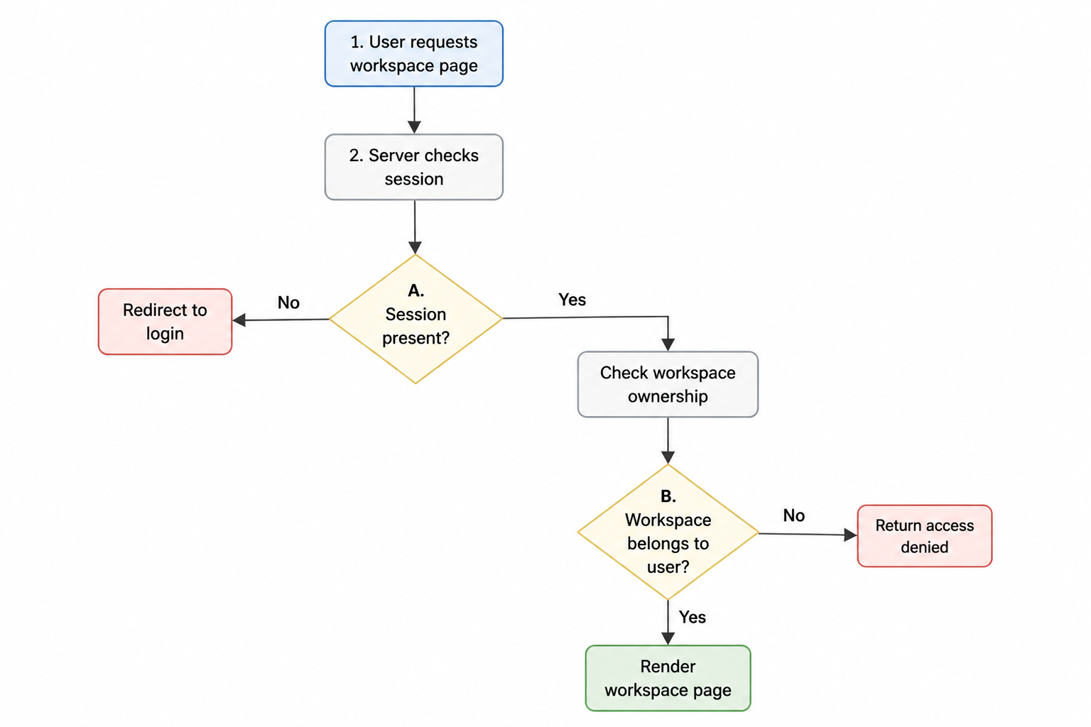
I also noticed AI did well when I gave it state transitions. For example: unauthenticated user requests workspace page, server checks session, if session missing redirect to login, if session exists but workspace doesn’t belong to user return access denied, if workspace exists render page. When the logic is procedural, AI tends to stay on the rails.
Why the security work was easier to direct
The backend code had three big advantages.
- The rules were binary. A route is protected or it isn’t.
- The surface area was contained. The code lived in known files and known request paths.
- The expected behavior could be tested quickly with direct inputs.
If login failed, I saw it immediately. If a reset token didn’t expire, I could test that directly. If a user accessed another user’s data, that was obvious and serious. The feedback loop was short and reliable.
Browser quirks don’t work like that. Mobile nav doesn’t fail as “wrong” in the same neat way. It sort of works, except when it doesn’t. Autofill doesn’t announce itself either. It silently confuses people, which is harder to catch during implementation.
Where AI looked confident and was wrong
The first big miss was Chrome autofill on the auth forms. The form looked fine. The fields had labels. The inputs submitted. Validation worked. Password reset worked. Everything looked complete.
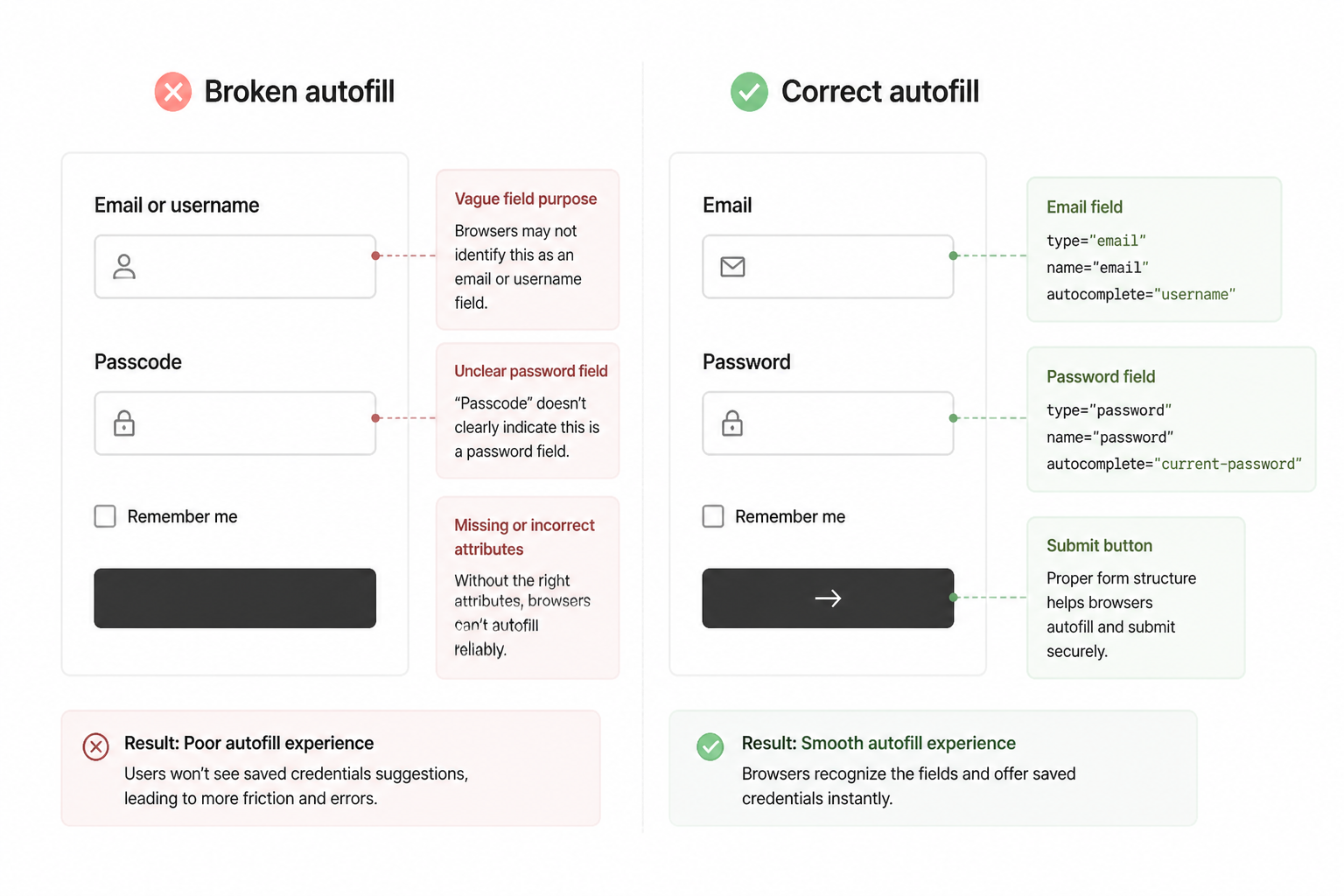
Then I tested the flow in Chrome with saved credentials and saw the usual autofill weirdness. Email filled into the wrong field in one version. In another, Chrome ignored the fields completely. I had an AI-generated login form that was technically functional and practically annoying.
The problem was that AI kept producing forms that looked semantically reasonable but weren’t tuned for how browsers actually decide autofill behavior. It would use plausible input names that didn’t match expected conventions, or move fields into wrappers that changed what Chrome inferred, or assign autocomplete attributes that sounded right and still behaved inconsistently.
I tried the obvious follow-up prompt: fix Chrome autofill so saved credentials populate correctly. That produced another polished answer. It changed attributes, cleaned up labels, and explained why the browser would now cooperate. It still didn’t fully work.
That’s the pattern I ran into several times. AI is strong at generating an explanation that matches common frontend advice. It’s weaker when the actual issue depends on undocumented browser heuristics and layout context.
I ended up solving autofill by testing actual combinations, not by trusting the explanation. I changed one variable at a time:
- input
namevalues autocompleteattributes- field order in the DOM
- whether the email and password were inside the same native form
- whether hidden or conditional fields appeared before them
The working version was more boring than the AI-generated one. Standard field names. Standard autocomplete values. Less abstraction. Fewer conditional wrappers. Once I reduced the cleverness, Chrome behaved.
That’s a good lesson in itself. AI often writes frontend code that’s a little too tidy in the abstract and not grounded enough in how browsers behave under weird conditions.
Mobile nav was even more annoying
The second miss was the mobile navigation. Again, the first version looked competent. It had a menu button, responsive breakpoints, and conditional rendering for the collapsed state. In a desktop viewport shrunk down in dev tools, it seemed fine.
On an actual phone, it wasn’t fine.
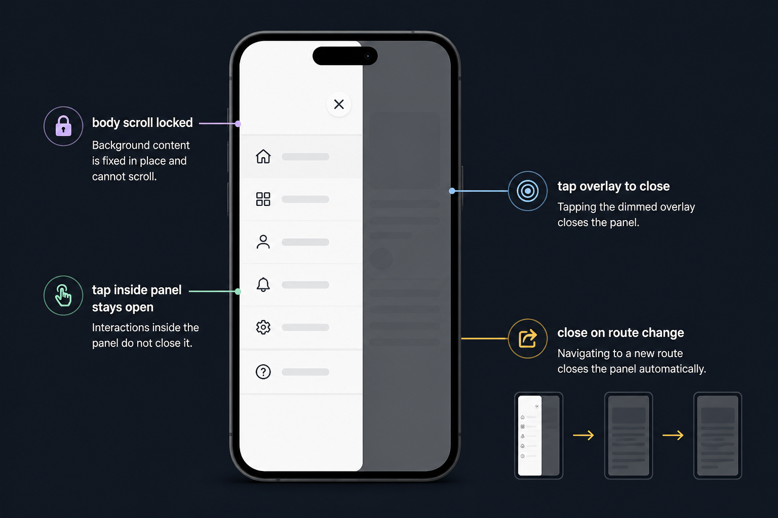
The hit target was too small in one iteration. The overlay didn’t consistently trap attention in another. Scroll behavior got weird when the menu opened over a long page. One version let the background page move while the menu was open, which felt broken immediately. Another version closed the menu at the wrong times because the event handling was too eager.
AI kept treating the nav as a component problem. It wasn’t. It was an interaction problem. Those are harder because correctness isn’t about syntax or structure. It’s about feel, timing, touch behavior, viewport constraints, and whether users lose context.
I had to step in and define behavior much more explicitly. Not “make a mobile nav.” More like:
When the menu opens on screens under the mobile breakpoint, lock body scroll, show a full-height panel from the left, keep the close button fixed at the top of the panel, close on route change, close on overlay tap, don’t close when tapping inside the panel, and keep touch targets at least thumb-friendly.
That got better results because it moved the task from visual generation to behavior implementation. Even then, I still had to test it on-device and fix edge cases by hand.
What I changed in my prompting after those failures
The bad frontend results weren’t random. They came from prompts that were too broad and too visual. Once I saw that pattern, I changed how I asked for help.
For backend and security work, broad prompts were often good enough because the implementation patterns are standardized. For UI and browser-specific behavior, I had to specify constraints, states, and failure cases in more detail.
Before, I might ask for “a clean login page with email and password and forgot password support.” After the autofill issue, I asked for “a login form that uses standard email and current-password autocomplete values, keeps email and password in the same form, uses explicit label associations, and avoids hidden inputs that could confuse Chrome autofill.”
Before, I might ask for “responsive sidebar navigation.” After the mobile issues, I asked for “mobile navigation behavior that locks body scroll, uses an overlay, closes on route change, preserves tap behavior inside the panel, and is tested against iPhone-sized viewport interactions.”
The prompts got less pretty and more operational. That improved the output.
What the actual build process looked like
I didn’t sit there chatting vaguely until something worked. The useful loop was tighter than that.
- Decide the exact feature boundary.
- Ask AI for a minimal implementation in the current stack.
- Apply the code in small chunks.
- Run the feature locally and try obvious failure paths.
- Patch specific issues with targeted prompts.
For auth, the cycle moved quickly because the failures were easy to reproduce. For autofill and mobile nav, the cycle slowed down because the failures depended on environment. Browser state mattered. Saved credentials mattered. Real device behavior mattered.
That’s why some “easy” UI work can burn more time than “hard” security work when AI is involved. The hard work is often well-specified. The easy work is often underspecified until a user touches it.
A pattern I trust now
I now divide AI tasks into two buckets.
| Task type | How AI performs | What I do |
|---|---|---|
| Structured logic with known patterns | Usually strong first pass | Review carefully, then test edge cases |
| Browser quirks and interaction details | Looks plausible, often misses reality | Specify behavior tightly and test on real devices |
| Security-sensitive code | Good at standard patterns, bad if requirements are vague | Never trust blindly, inspect every line |
| Visual polish | Fine for drafts, weak on fit-and-finish | Use as a starting point, then tune manually |
This isn’t a statement about AI being bad at frontend and good at backend in some absolute sense. It’s about where the feedback loop is clean. AI improves when the target behavior is explicit and testable. It struggles when software correctness depends on hidden heuristics, sensory feel, or device-specific interaction.
The trade-off that became obvious
AI saved me time on the dangerous parts, but only because I treated it like an implementation assistant, not an authority. I got secure-ish default patterns quickly, then verified them. On the visible UX bugs, AI often cost me time at first because it gave me code that looked done before it actually was.
That false sense of completion is the real trap. A route guard that fails usually throws an obvious problem. A login form with bad autofill quietly adds friction to every returning user. A mobile nav with touch issues doesn’t crash anything, but it makes the product feel careless.
So the trade-off wasn’t “AI can do hard things but not easy things.” The trade-off was that AI handles formalized problems better than human-perception problems. Security code often has stricter rules than UI polish, which means the so-called hard parts are sometimes easier for a model to generate correctly.
What surprised me most
I expected to spend my manual energy on auth, access control, and account safety. Instead, I spent a weird amount of time on things like field naming, body scroll locking, overlay click handling, and mobile tap behavior.
That didn’t make the AI output useless. It made the role of the builder clearer. The model can produce a strong baseline for known architectural patterns. I still have to be the person who notices when browser behavior is off, when a touch target feels cramped, when a saved password doesn’t populate, or when the menu interaction feels unstable.
If you’re building with AI inside a fast iteration environment like MakerWS, that’s the split I’d plan for. Let AI draft the formal systems. Stay very awake on user-facing interaction details. The second category is where “looks done” and “is done” drift apart.
How I’d approach the same work now
If I were starting Hot Glue’s account and navigation features again, I’d keep the same AI-assisted approach for auth. It worked. I’d still break the work into narrow backend tasks and inspect every security-sensitive change manually.
But I’d front-load browser and mobile testing much earlier. I’d test Chrome autofill before calling the login form done. I’d test mobile nav on a real phone before polishing desktop layouts. I’d also prompt for browser behavior with more mechanical detail from the start instead of asking for generic responsive components.
The main change is expectations. When AI writes account security code, I assume it might be correct but needs review. When AI writes UI for browser and mobile edge cases, I assume it might be persuasive but wrong until proven otherwise.
The useful takeaway
Hot Glue’s build taught me that “hard” and “easy” don’t mean much when you’re working with AI. The model isn’t judging difficulty the way a developer does. It’s pattern-matching against how well-defined the job is.
Auth, sessions, and route protection were defined enough that AI could produce solid work quickly. Chrome autofill and mobile nav depended on messy browser behavior and physical interaction, so the output looked finished before it was reliable.
That’s now part of how I build: use AI where the shape of correct code is known, then spend human attention where software meets actual hands, screens, and habits. That’s where the obvious stuff stops being obvious.